- Overview
- Installing Theme and Plugins
- Demo Content Installation
- Getting Started
- Theme Options
- Sidebars / Widgets
- Setting the slider
- Setting the pages
- Setting the Blog
- Setting the Portfolio
- Setting the Team Members
- Setting the Testimonials
- Setting the Client's Logo
- One-page site
- Visual Composer
- Setting WPML Multi-Lanuage
- Translation
- Shortcodes
- FAQ
- Sources / Credits
Getting Started
Know theme's different areas
Here we described all the differnt areas and what it's called in our theme so you can find right option in Theme Options section.
-
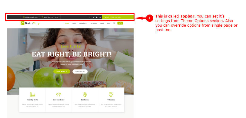
1. Topbar
-
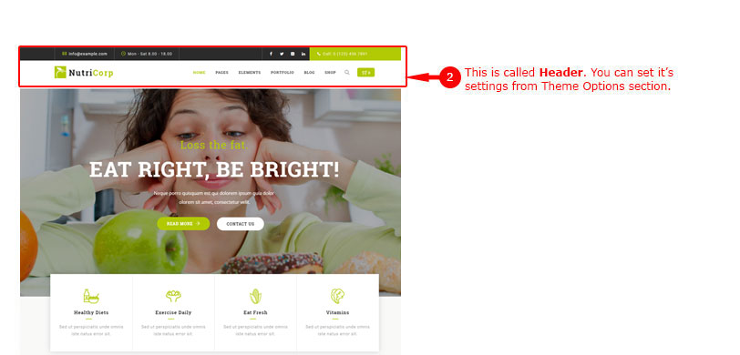
2. Header
-
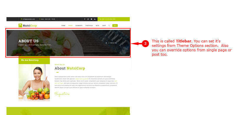
3. Titlebar
-
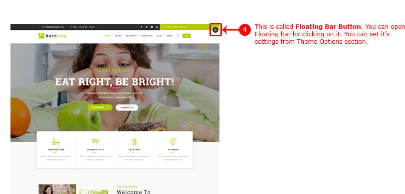
4. Floarting Bar Button
-
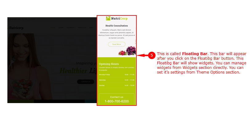
5. Floarting Bar Content
-
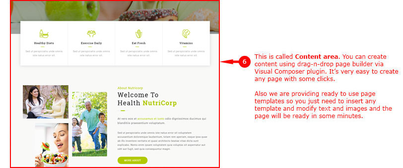
6. Content Area
-
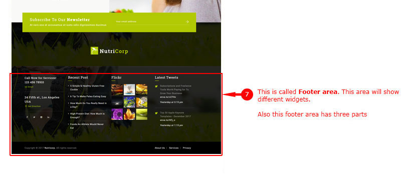
7. Footer Area
-
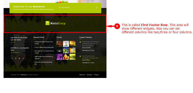
8. Footer Area - First Row
-
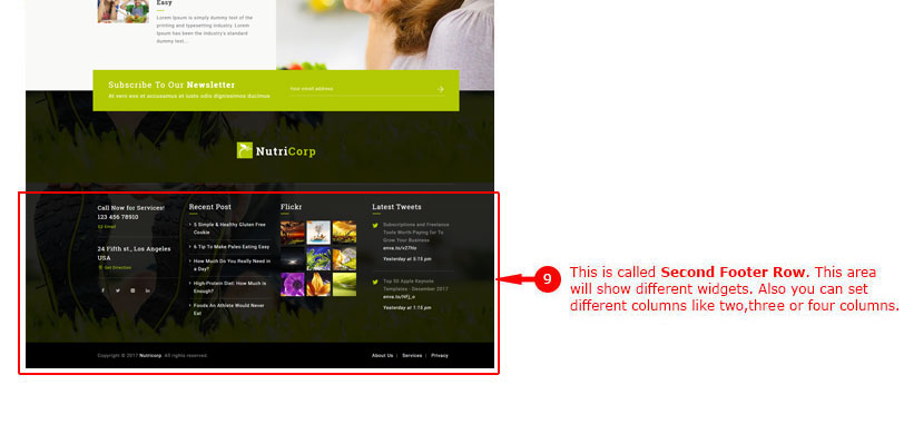
9. Footer Area - Second Row
-
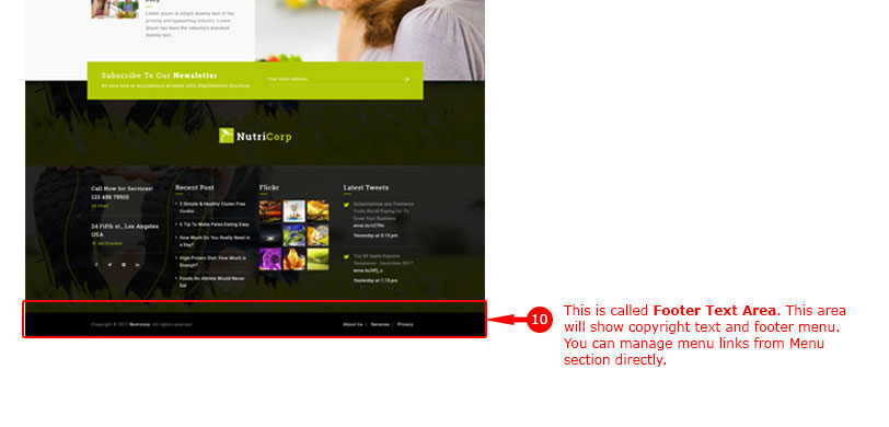
10. Footer Area - Copyright Text Area
Getting Started With Visual Composer
As Demo Content setup is complete on your site, we now discuss how to create / modify pages on your site. NutriCorp themes comes with Visual Composer plugin, so creating / editing pages is very easy with Visual Composer page builder.
We'd recommend you to read Visual Composer documentation online by clicking here. This will help you understand Visual Composer functionality easily.
You can create new page on your site from Admin > Pages section. You can start creating any layout of your choice with Visual Composer page builder. Also we are providing some predefined Page Templates to get exact look as some of our pages shown on our demo site. We will discuss more on this below at Visual Composer Templates.
Create page using Visual Composer Templates
Templates are readymade page contents. We are providing some ready-to-use templates via Visual Composer directly. So you can create page with some clicks only. This is the easiest way to create attactive pages without any extra work. Here are steps for how to use it:
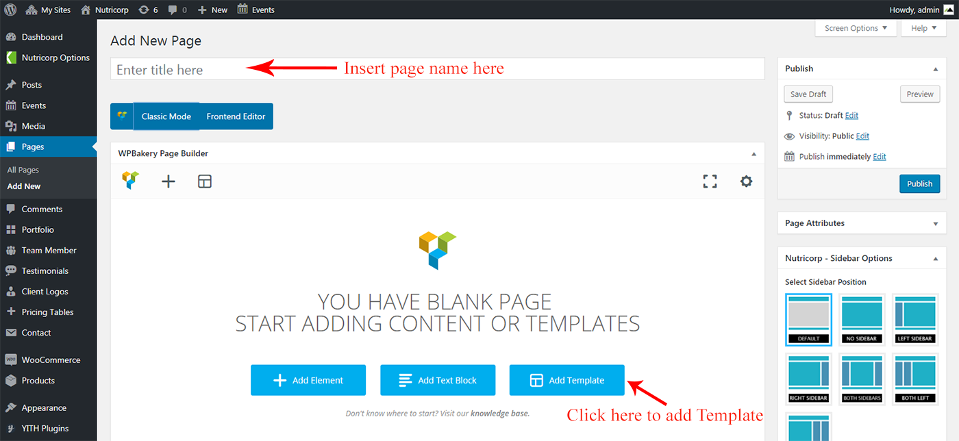
- Create a new page on your site from Admin > Pages section.
- Input a new name for your page, and now using Visual Composer page builder's Backend Editor's click on "Add Templates" button, see screenshot below:
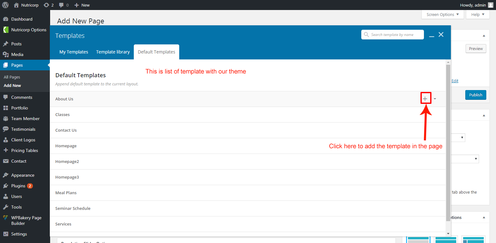
- From the list of Predifined Teamplates select template you like to import it on your page, see screenshot below:
- Here is how the page content will look after you insert Template:
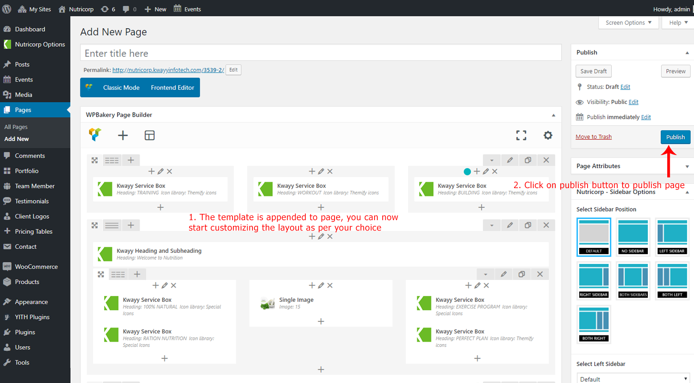
- Now see the page in action
- Done!
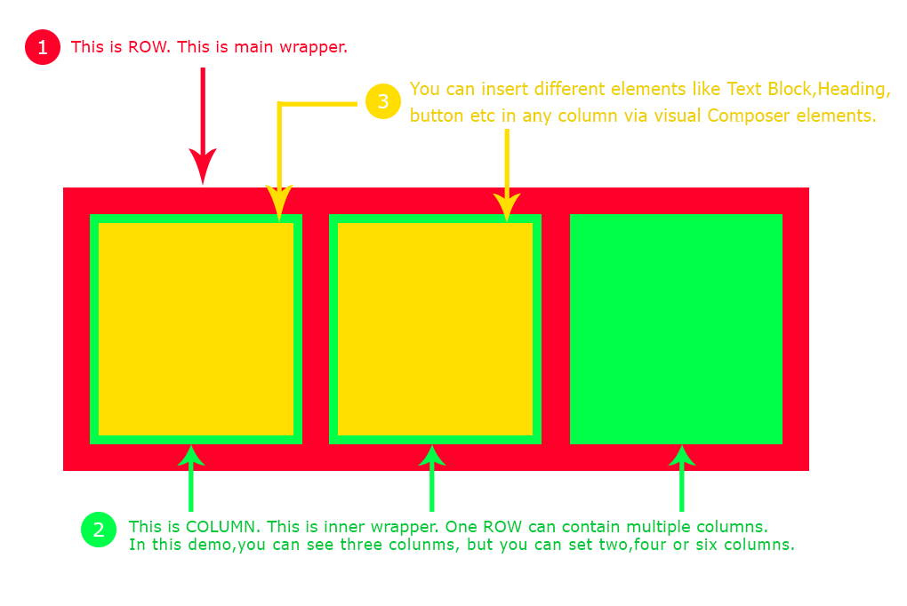
Visual Composer Row & Column
“Row“ is the main content element of Visual Composer. Rows are used to divide your page into the logic blocks with columns, columns later will hold your content blocks. Rows can be divided into the layouts (eg. 1/2 + 1/2, 1/3 + 1/3 + 1/3, and so on). Your page can have unlimited number of rows. To change row's position, click and drag row's drag handler (top left row's corner) and drag row around (vertical axis). Please see below screenshot:
NutriCorp theme adds some extra option to the Row element of Visual Composer to enhance the functionality of VC Row. We will discuss them below.
Here are some very good documentaion videos showing detailed option of Visual Composer Row and Columns. Watch them at this link.
ROW options
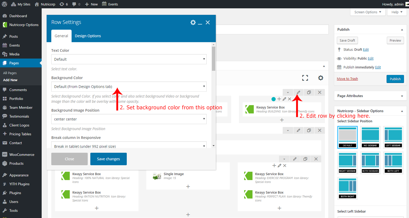
There are so many options in ROW. You can set background color, background image, parallax image etc. For flexibility, we added three extra options to Visual Composer ROW:
- Text Color:
You can set Text for the Row from this option. There are Four options to choose from (Default, Dark Color, White Color and Skin Color)

- Background Color:
You can set Background Color for the Row from this option. There are Five options to choose from (Background Color & Image set in "Design Options" tab (default), Dark Grey Color, Grey Color, White Color and Skin Color).
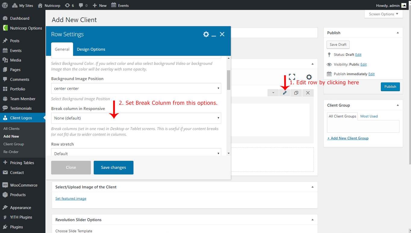
- Break Column in Tablet:
Break columns in Tablet mode (<996 screen size). This is useful if your content breaks (or not fit) due to columns in tablet mode.
COLUMN options
“Columns“ are part of the row and they hold your content elements inside them. Columns can be reordered. Click and drag column around (horizontal axis). That way you can group elements in logical groups and then drag them around with your mouse (to re-position).
Here are some very good documentaion videos showing detailed option of Visual Composer Row and Columns. Watch them at this link.
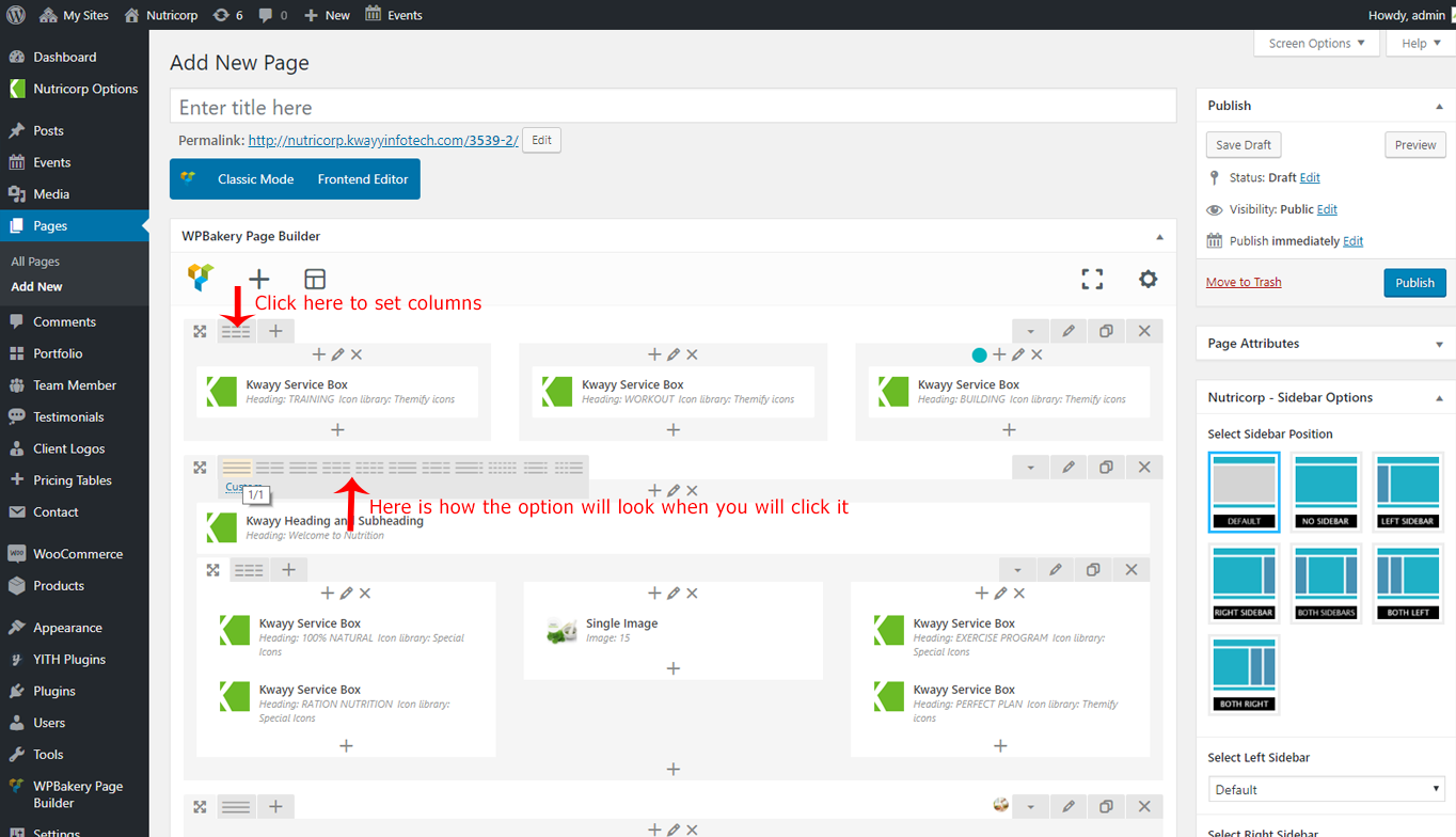
You can easily set COLUMNS layout via ROW directly. See screenshot below:
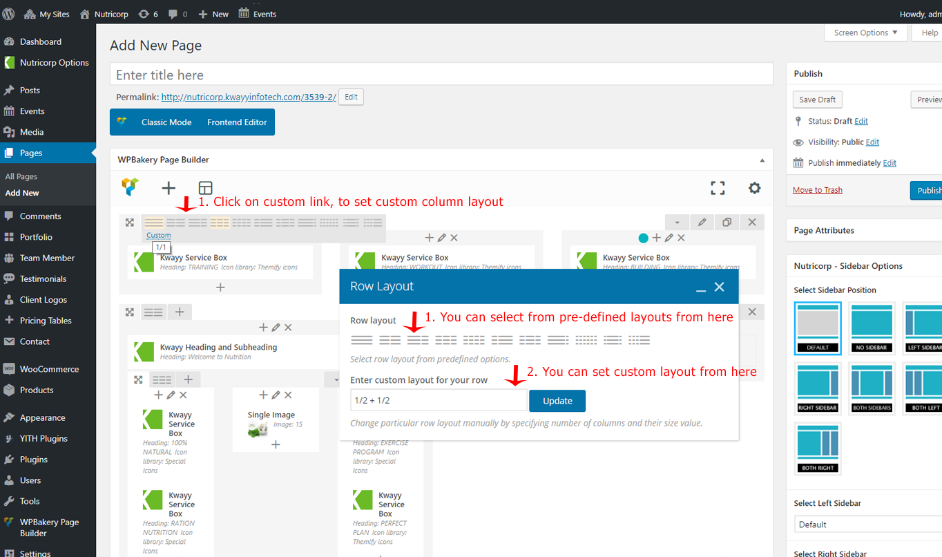
You can also set custom columns layout by clicking over the Custom Link see screenshot below:
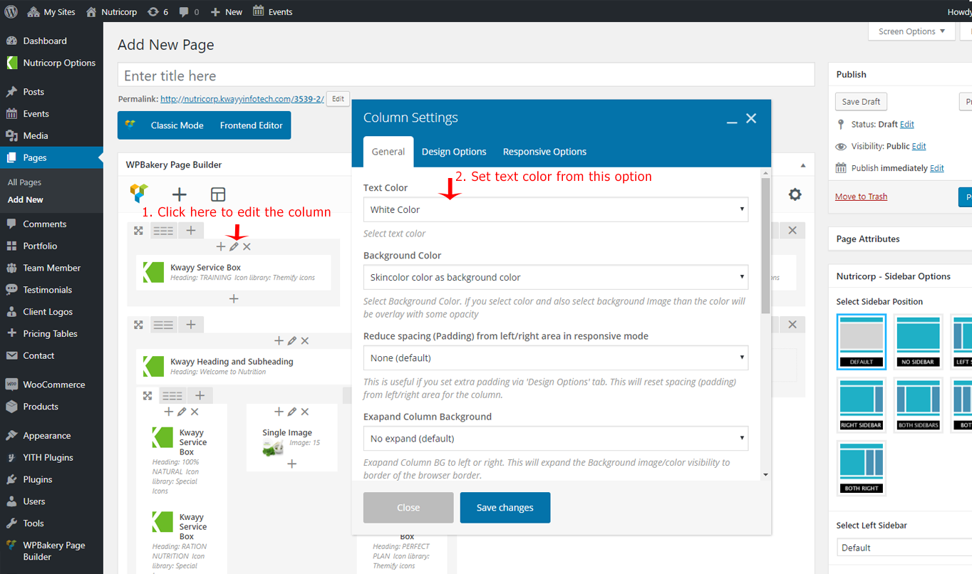
NutriCorp theme adds some extra option to the Columns element of Visual Composer to enhance the functionality of VC Column. We will discuss them below.
We add Two option to Visual Composer Column element those are as under:
- Text Color:
You can set Text for the Column from this option. There are Four options to choose from (Default, Dark Color, White Color and Skin Color)
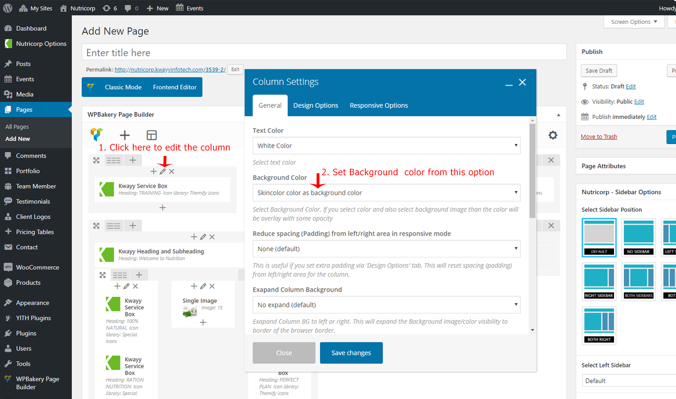
- Background Color:
You can set Background Color for the Column from this option. There are Five options to choose from (Background Color & Image set in "Design Options" tab (default), Dark Grey Color, Grey Color, White Color and Skin Color).
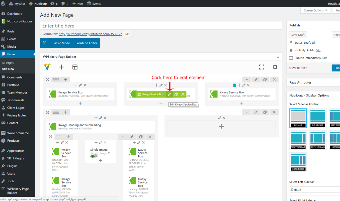
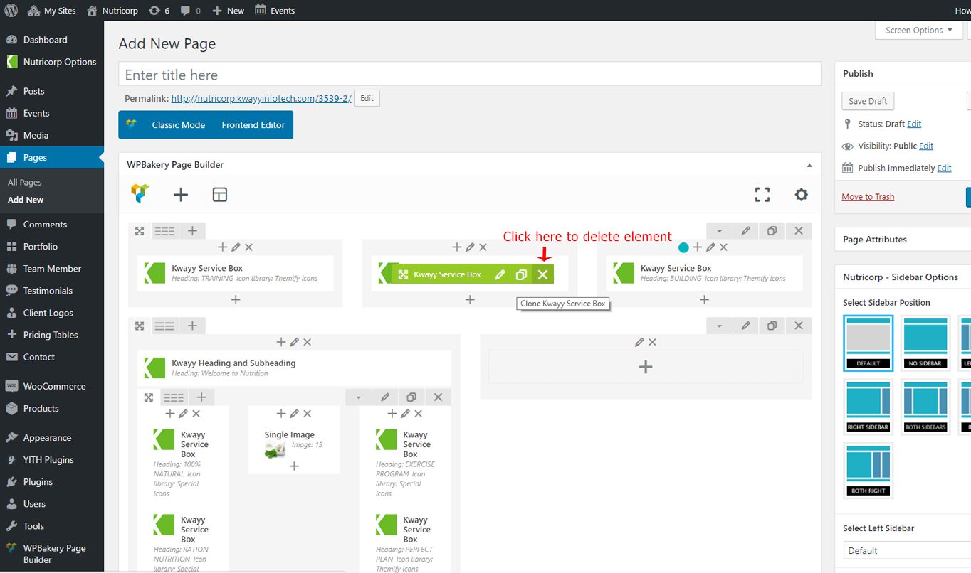
How to Edit / Clone / Delete Visual Composer Elements
Edit / Clone / Delete Visual Composer elements is very easy. Just hover over the element you like to edit and you will see buttons to (Edit, Clone and Delete) it.
Edit the page you like to modify. We will edit the Kwayy Service box element in below screenshot, but these option will be available for each Visual Composer element
- Hover over the element and click on Edit button to open options box:
- Hover over the element and click on Clone button to clone (duplicate) the element:

- Hover over the element and click on Delete button to delete the element:
This is basic information about the Visual Composer. Now you can try it yourself and create some page yourself. If you like to learn more about Visual Composer than plesae click here and read their official document.